In the United States, about 1 in 10 babies is born preterm - 10.4% of live births in 2024. Preterm birth and low birth weight together account for roughly 14% of infant deaths, making them the second leading cause after birth defects.
Ultrasound AI was built around a specific gap in that problem. Ultrasound hardware has improved enormously over three decades; the ability to interpret what the images contain has not kept pace. Their platform, Preterm AI, reads standard ultrasound images and surfaces characteristics a clinician can act on - not to replace judgment, but to give it something earlier to work with.
MitoPop was brought in for investor and partner digital strategy. We led the website and the design system underneath it.
The instinct with a prenatal health platform is to design for expectant parents. That would have been the wrong site.
The company had three business objectives, in order: raise operating capital to fund an FDA submission, identify OEM partners who could embed the technology in existing ultrasound machines, and eventually acquire clinical customers. Awareness inside the prenatal care community mattered, but it was third on the list.
So the site is a fundraising instrument that happens to look like a marketing site. Its job is to make a room full of healthcare investors and device manufacturers believe that a small team has something defensible - credible enough clinically to pass regulatory scrutiny, and concrete enough commercially to slot into someone else's hardware.
Every decision followed from the audience. Investors read differently than patients do - they skim for evidence, defensibility and team, and they lose patience with reassurance. The copy leads with mechanism, the visuals lead with the data, and nothing on the page asks the reader to feel something before it has shown them something.
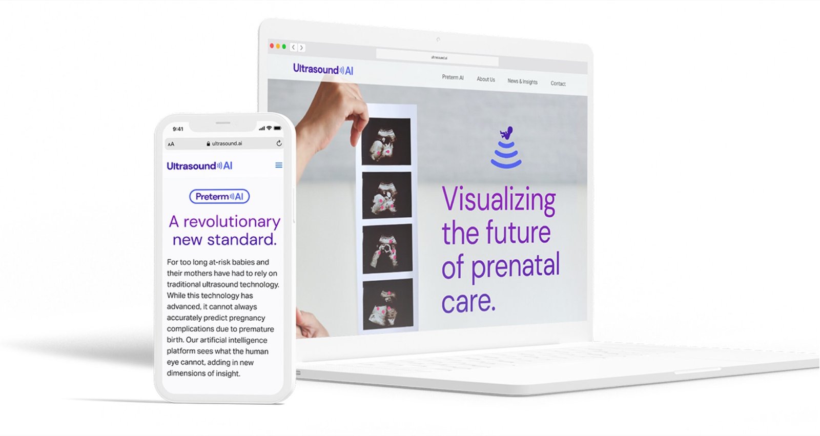
The identity had to carry a hard combination: clinical enough that an OBGYN takes it seriously, and modern enough that a healthcare VC reads it as a technology company rather than a device vendor. The wordmark solves it in one move - an ultrasound wave built into the letterforms, with "Visualizing the future of prenatal care" as the line underneath.

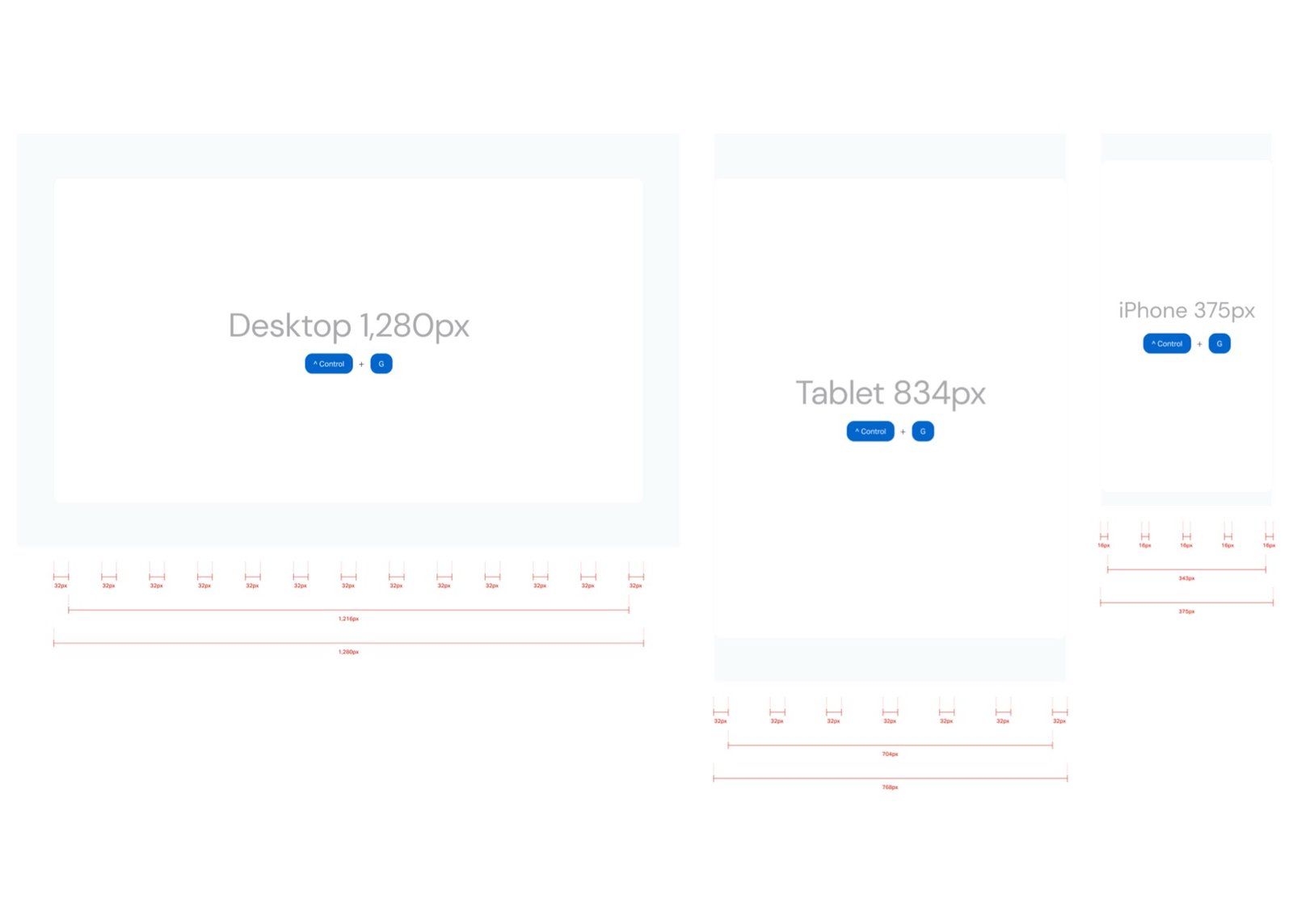
Underneath the visual identity sits the part that made the build fast: a documented responsive system rather than a set of comps. Three breakpoints, explicit column counts, explicit gutters, explicit content widths.
Specifying the grid to the pixel before building anything is dull work, and it is the whole reason the component library held together. Every block was designed once against known column widths, which meant responsive behaviour was settled once in the system instead of renegotiated on every page.
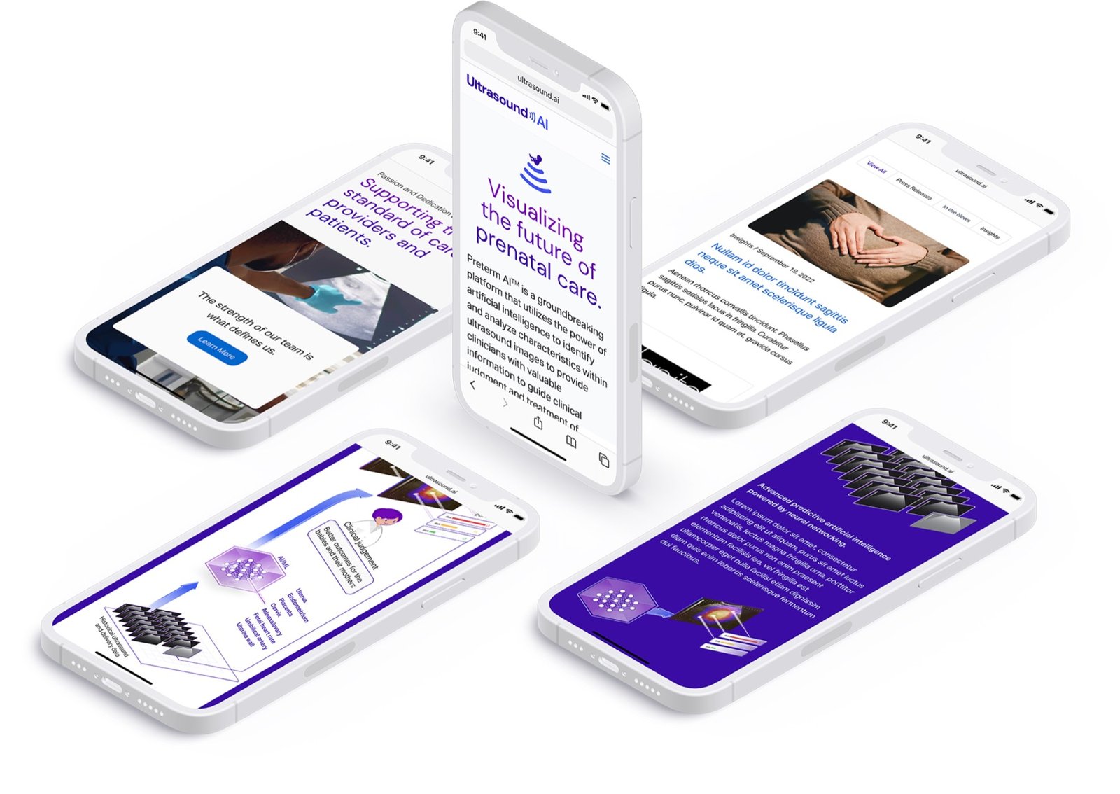
A custom WordPress theme, written by hand. No page builder, no framework, minified CSS, SVG logos, and a complete icon and web-manifest set - the things that cost an hour each and are invisible until they're missing.
The measurable result: the site shipped roughly 40 KB of HTML with eight scripts and eight stylesheets. For reference, the page-builder rebuild that replaced it years later ships around 209 KB of HTML, seventeen scripts and thirteen stylesheets for a comparable homepage - about five times the markup for the same job.
Those figures are measured, not estimated - the 2022–23 build is preserved in the Internet Archive and the current site is live, so both are checkable. The site has since been rebuilt by another team around the company's Delivery Date AI product; what's described here is the version we led.
The hardest design problem on the project was not layout. It was this: an ultrasound image is already illegible to a non-specialist, and the entire value proposition is that the platform finds signal inside it that a human eye cannot. How do you show that to someone who is neither a radiologist nor an engineer?
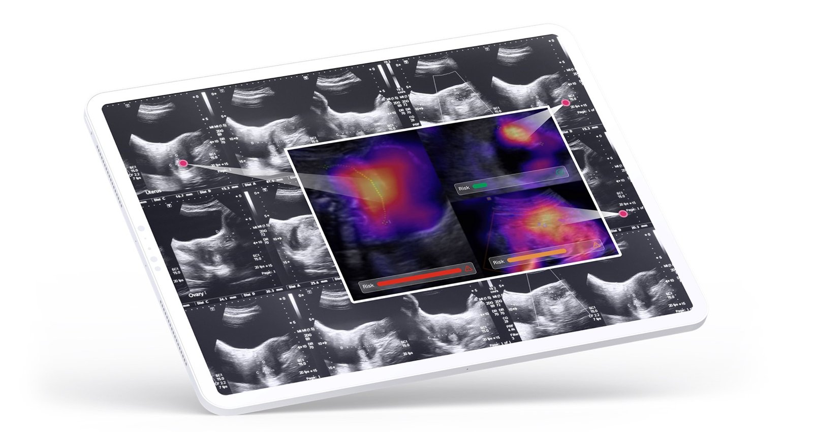
The answer was to stop trying to explain the model and show its attention instead - saliency overlays on real scan sequences, with risk states rendered as plain colour. An investor doesn't need to understand the architecture. They need to see that the system is looking somewhere specific, consistently, and that a clinician could act on where it looked.
When the product is a model, a diagram of the architecture proves nothing. Show where it looked instead. That is what a sceptical expert asks for anyway.
The positioning did its job in the rooms it was built for. Ultrasound AI won the Wavemaker Three-Sixty Health investment prize at the Ignite Healthcare Network competition, and was named an innovation showcase finalist at the Women's Health Innovation Series Summit in Boston.
The longer arc is the more interesting one. The capital this work was built to raise was earmarked for an FDA submission - and in March 2026, Ultrasound AI received FDA De Novo clearance for its Delivery Date AI technology, backed by a peer-reviewed study of more than 5,700 patients reporting a 0.92 R² accuracy in predicting days to delivery.
A clearance is won by the science, the clinical study and the regulatory team - not by a website. What the site did was help a small company get in front of the investors and partners who funded the years of work in between. That's the honest version, and it's the one worth claiming.